ZHAOHUI ZHAO
"THE PLAY INSTINCT"
BY PAUL RAND
In this project, I was tasked with creating a booklet for Paul Rand's article "The Play Instinct" that is befitting and pertinent to the content of the article.
In the article, Paul Rand talks about the link between, art, play and teaching: "Granted that a student’s ultimate success will depend largely on his natural talents, the problem still remains: how best to arouse his curiosity, hold his attention, and engage his creative faculties. Through trial and error, I have found that the solution to this enigma rests, to a large extent, on two factors: the kind of problem chosen for study, and the way in which it is posed. I believe that if, in the statement of a problem, undue emphasis is placed on freedom and self expression, the result is apt to be an indifferent student and a meaningless solution. Conversely, a problem with defined limits, implied or stated disciplines which are, in turn, conducive to the instinct of play, will most likely yield an interested student and, very often, a meaningful and novel solution."
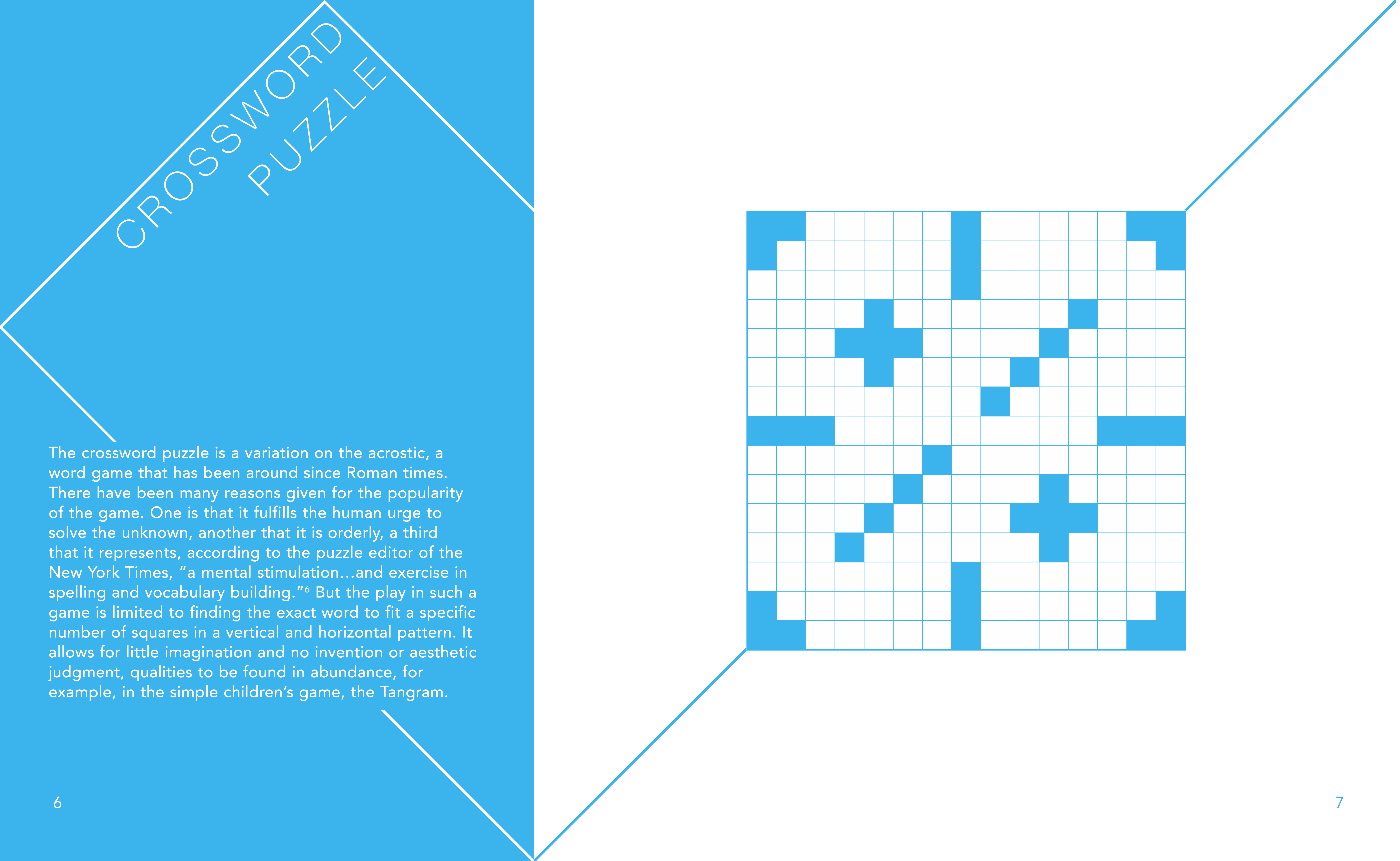
Then he uses well-known examples in art and play to elaborate his point: for example, he used the popularity of the crossword puzzle to demonstrate the power of "the human urge to solve the unknown" and Le Corbusier's "Modulor" to illustrate less-confining system of proportion enabled "endless variations and opportunities for play" and achieve harmony and order in a given work.
After I finished reading the article, the idea of combining playfulness, art into a design brought me to the underlying principle of Modulor -- the Golden Ratio: it has long been used to construct aesthetically pleasing projects like the ancient Parthenon temple; in addition, typesetting using the Golden Ratio is highly uncommon, meaning it is novel, and if used properly, could create playfulness in the composition.
To begin with, the very size of my book is a rectangle in Golden Ratio. And the design takes advantage of the entire spread, which is divided into sections using the Golden Spiral.
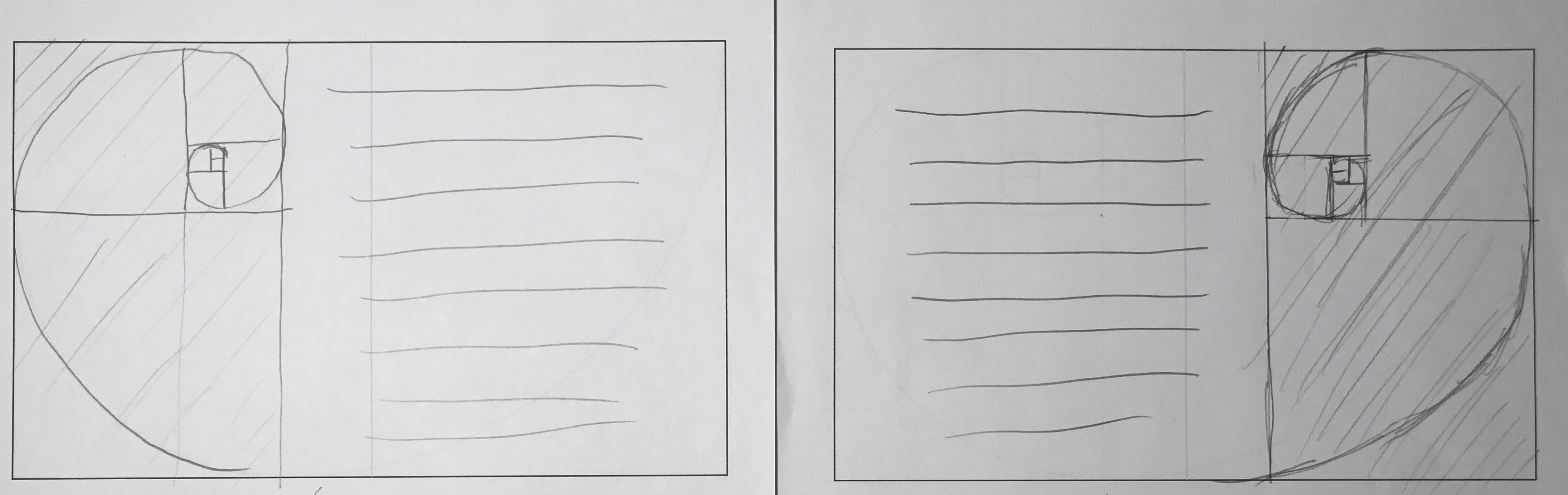
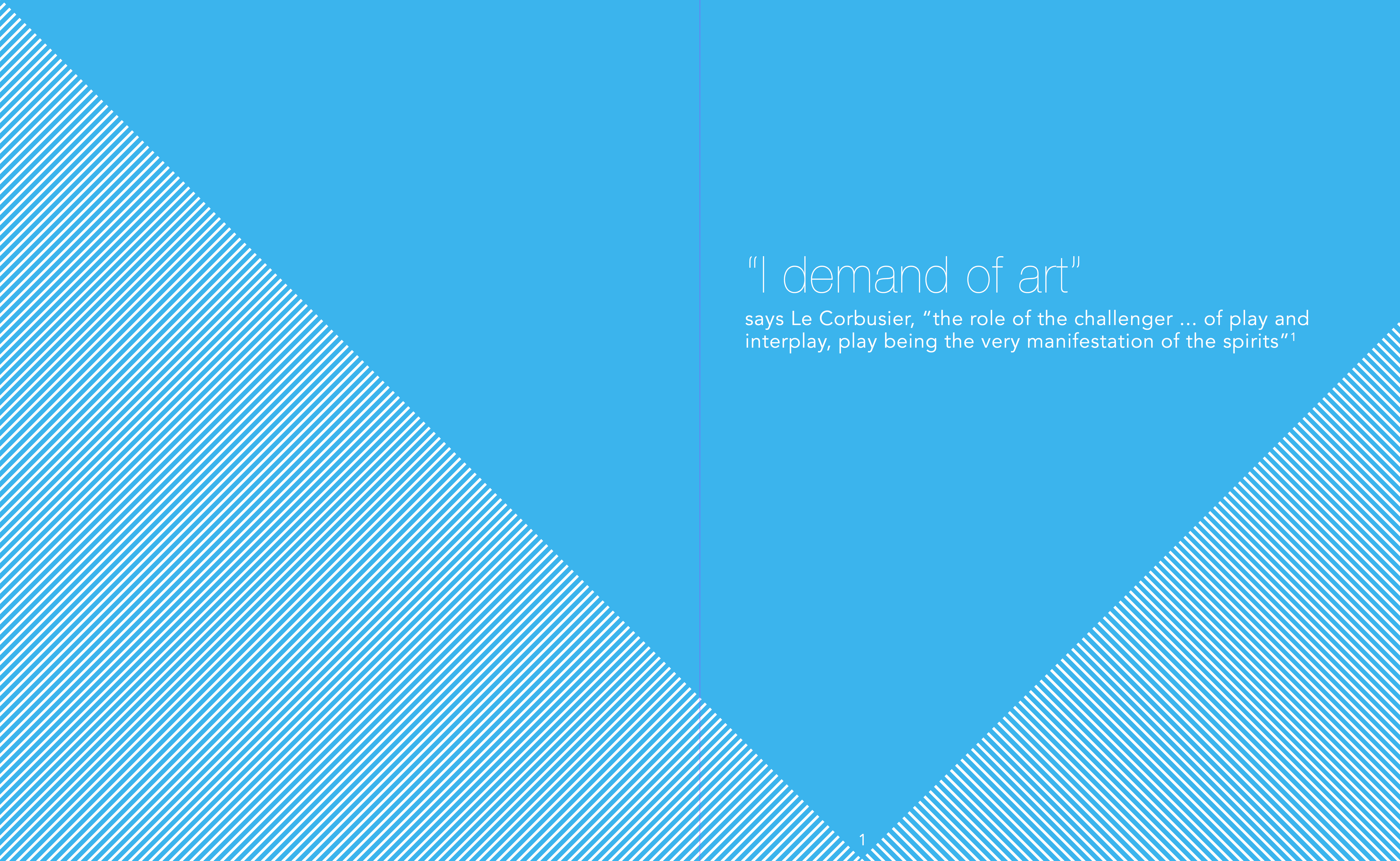
Then, I accentuate the golden division using lines connecting the vertices of the spiral. And the color is also hand-picked: I knew from the start that I wanted a tint of sky blue, as it association to the pureness of the sky relates to the human instinct and the vividness and liveliness of blue accentuate the playfulness.
Then the actual content and elements went into the composition following the same guidelines.
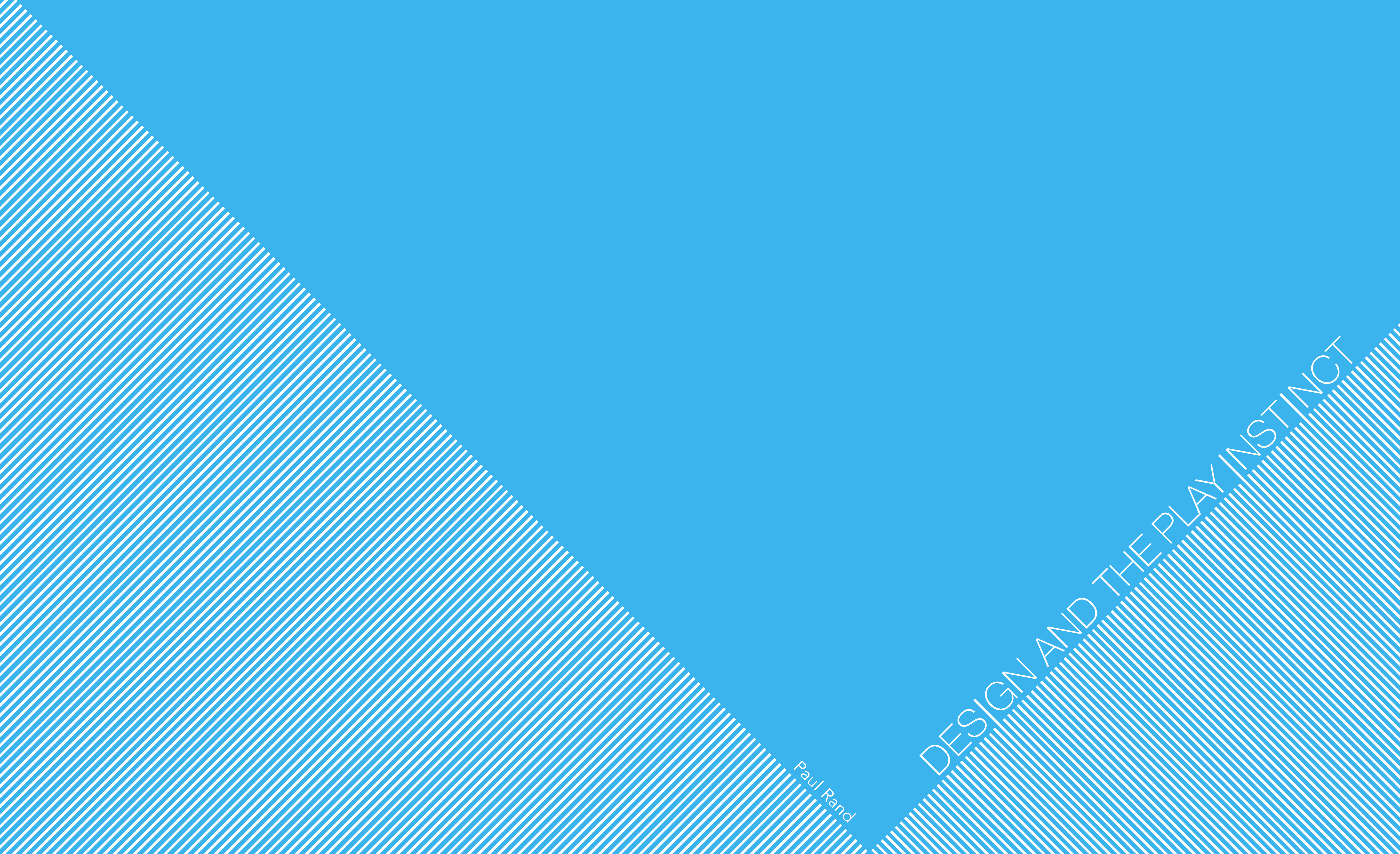
Although it is often said "Do not judge a book by its cover," the cover of a book does greatly influence and inform the perception and interaction of readers with the book. Therefore, a lot of effort went into designing the cover. As the underlying structure of the whole book, Golden Ratio of course made its way into the design. The individual lines angled symmetrically distinguishing the covered area, together with the detail that the letter "I" in the title are connected to the lines, deliver straightforwardly the sense of playfulness to the reader at first sight.