ZHAOHUI ZHAO
TYPEFACE POSTER
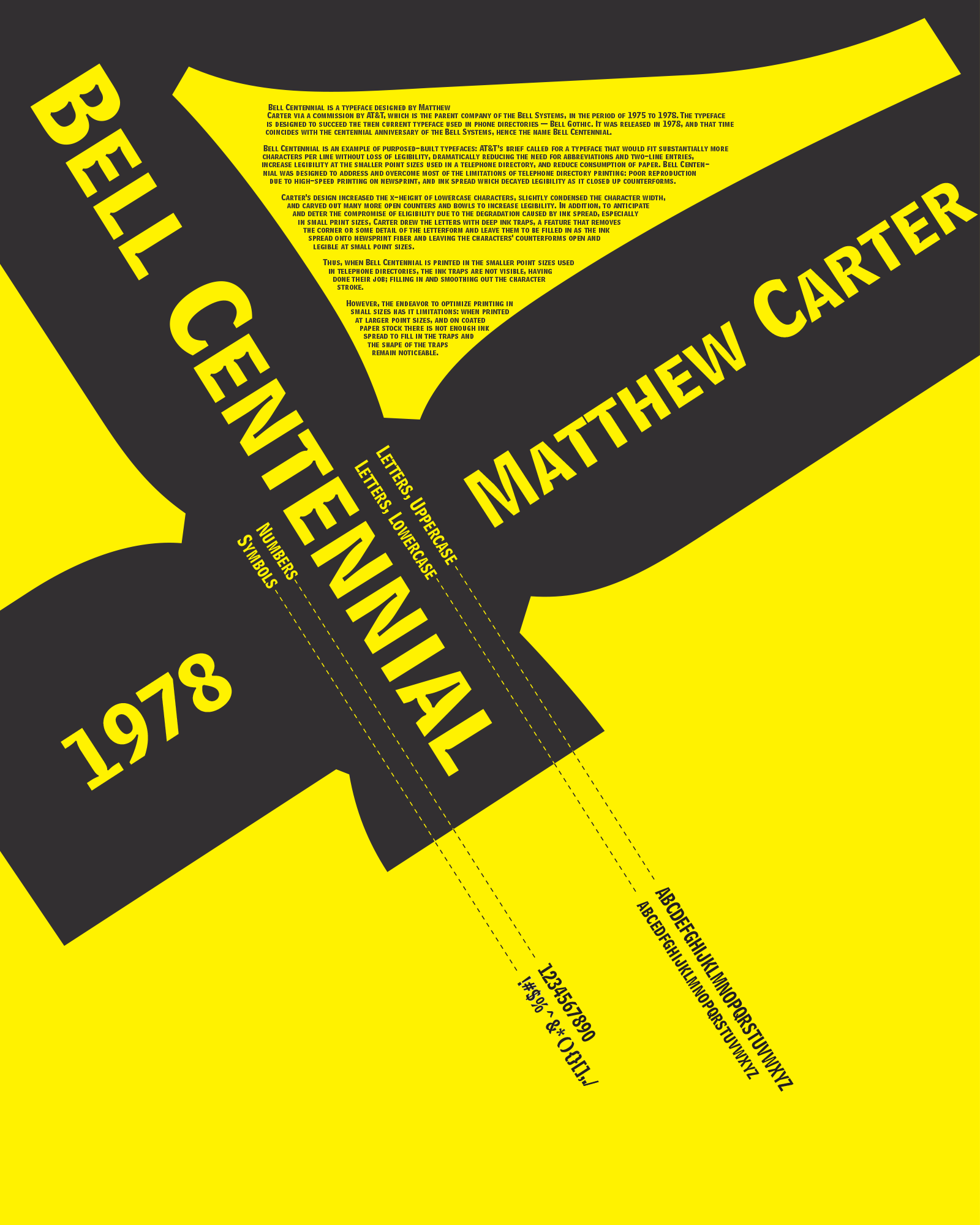
The ojective of this project is to create a poster for the typeface Bell Centennial, and I drew inspiration from the functionality of the typeface:
Bell Centennial was designed by Matthew Carter for AT&T in the period 1975-78. Its purpose was to address the legibility issue for phonebooks printed in cheap ink, on inferior paper and in dense typesettings.
Therefore, the typeface had some very characteristic carvings and openings designed to anticipate the spread of ink. And my design emphasizes that character of functionality: the main component of the poster is a huge character "4," which showcased the carvings.
Furthermore, I used phonebook-style elements in the design, like dotted lines connecting relevant elements, to further accentuate the functionality of the typeface.