ZHAOHUI ZHAO
XIAOCUN TRADE
The project's name is in Chinese and transliterates to “Small Village Big Goods.” And I was on the Product/UIUX design team. Currently, we have 3700 total users, and 80% percent of the Chinese students in UC Davis are using the product and it is still undergoing iteration as we speak.
There are more than 2000 Chinese students studying in UC Davis, but most of them don’t trust or don’t know or how to acquire services like trading and finding roommates using social networks like Facebook, either because they have never used Facebook before or too few people they know are on Facebook. Because social networks like Facebook are banned in China.
So Xiaocun Dayou team decided to address this issue.
Problem:
How to build a THING that Chinese students would want to use for trading and other services?
Research:
Surveys among Chinese students distributed online and offline indicated that need for a platform of trading and other services does exist and have a market.
Product Concept:
To build a platform on a familiar host for Chinese students in UC Davis to provide services like trading, finding roommates and ordering delivery.
Design goals and concept:
- A reliable and easy-to-use implementation, best would be an app.
- An system that could be expanded to add more features.
After the high-level strategy/decision making, we moved forward with the implementation, and the first thing we considered was the the host of the product: we don’t have any iOS or Android developers, so an app would be unrealistic.
We then opted for WeChat Mini Program as our host platform, as it only requires the tools used in web like HTML, CSS and Javascript to develop, and that falls within my team’s capabilities. And most importantly, being on this platform almost instantly gives us an huge user base: setting up and start using an Mini Program for WeChat users only require as little as two taps, and WeChat itself is used by almost every Chinese with 963 million daily active users.
With the groundwork laid out, we started the design.
First Iteration:
Sketches:
At first we started with a rather packed thumbnail view for displaying the items, as we wanted to display as much information to the users as we can.
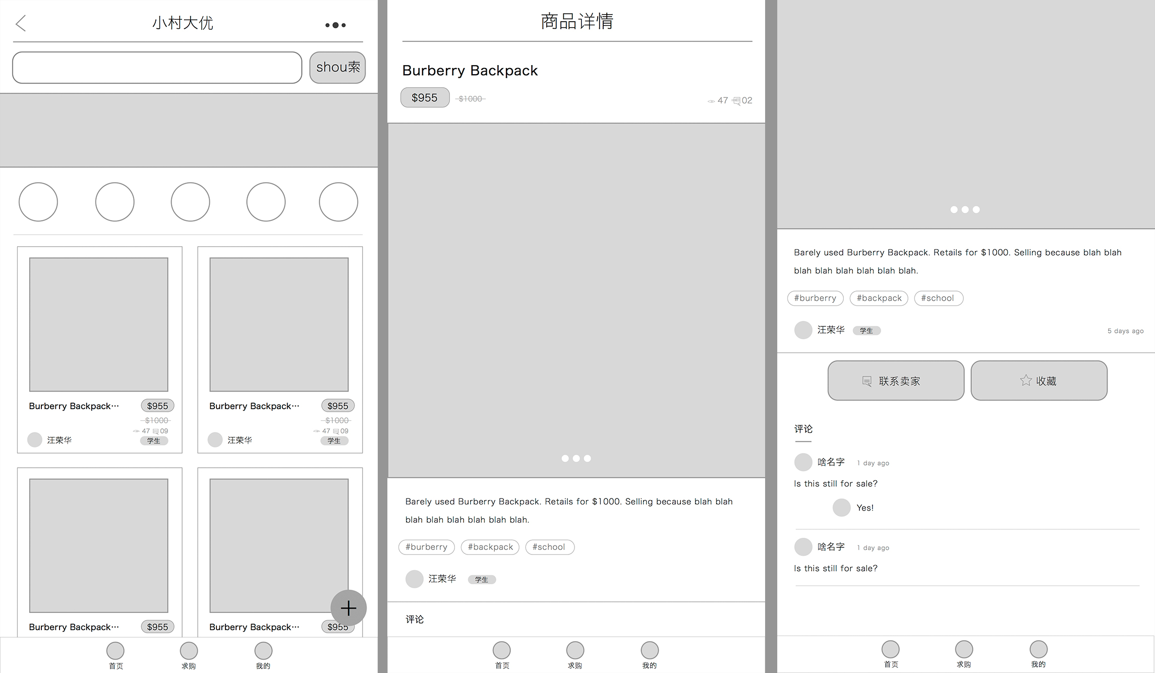
Wireframe:
Beta:
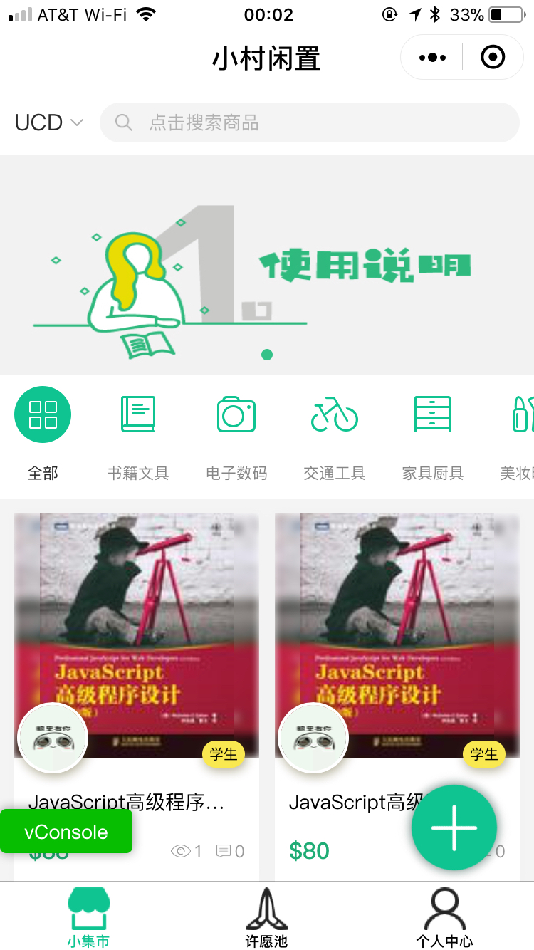
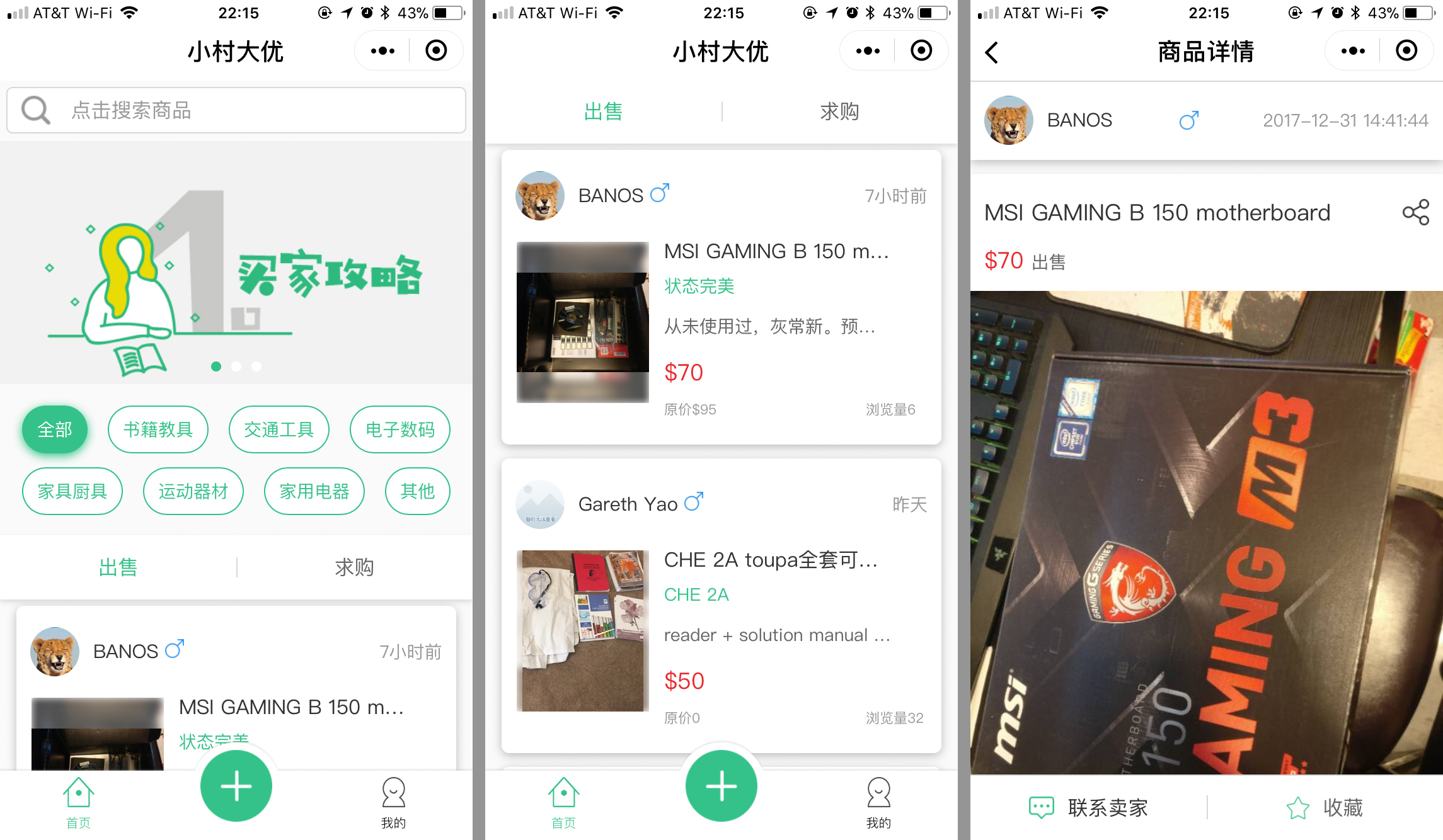
But we found out through testing that our users find this layout inefficient: the information in the thumbnail is oftentimes not sufficient so users had to click into the item page to confirm whether the item was the one they wanted.
Second Iteration:
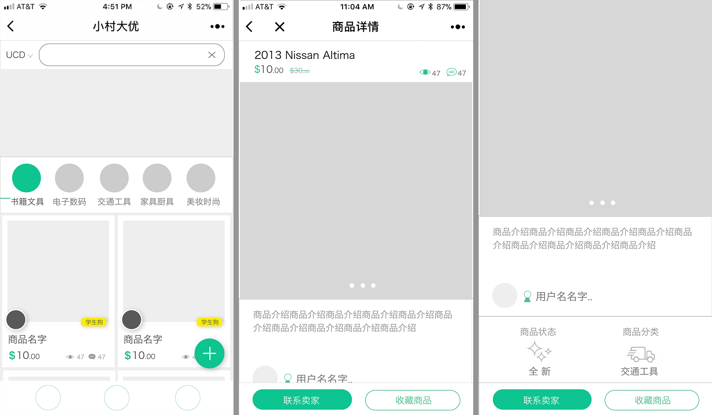
For the second iteration, which is also our current iteration, we adopted a list view for displaying the items per the users suggestions, and we refined some visual details, for example, the “Add” call to action button was moved to the nav bar to create a cleaner look and the tags on top of the page was laid out in a “field” rather than a “strip” to be scrolled horizontally in the original version for quicker access.
This platform is still undergoing iteration and adding new features as we speak.
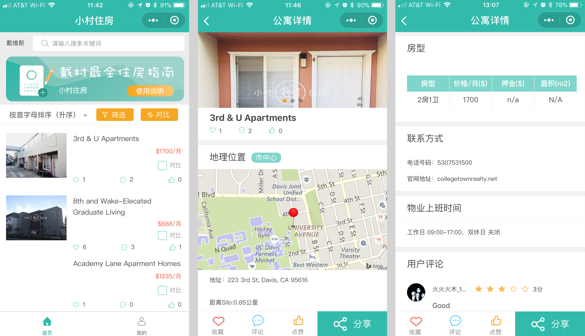
Here is a sneak peak of our renting platform that is still under development, I can’t talk about in detail yet: